HORSE, A lot More Than Meets the Eye

Gallery Diet has been a part of Wynwood’s art scene long enough for many locals to imagine its layout. So we’ll say exactly what most people think when they walk inside: What a waste of space — intentionally so. Mateo Tannatt, an L.A.-based artist making his first solo effort in Miami, is an agent provocateur whose work, or rather the appreciation of his work, relies on a little legwork from the viewer.
This is not a question of what constitutes art or the pornographic verbiage that’s usually unsolicited to explain it; this is a form of art pranksterism that’s most closely related to entertainment that surreptitiously educates.
Tannatt’s body of work deals with “formal inquisitions of space via sculpture, video, and painting,” according to the gallery’s press release. This has been evidenced by his Frieze Projects venture in 2013, for which he created a landscape from objects and props and had a performative element with actors and performers working from scripts that allowed viewer participation.
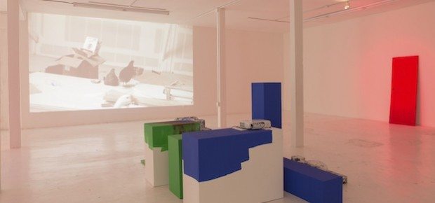
In Gallery Diet’s exhibit, the main room is populated by a rubber sculpture of a door, a metal sculpture of two halves of a large pipe, and a conglomerate of odd-sized/shaped boxes in varying degrees of completion assembled closely in the middle of the room. Studio Agony (Revisited), his most recent video work, is projected on the gallery’s largest wall. The effect is immediate, or rather immediate after you realize its purpose.
In his preview of this month’s Second Saturday Art Walk, New Times art critic Carlos Suarez De Jesus succinctly summarizes the purpose: “Tannatt offers a contrasting meditation on the shifting nature of the urban landscape” and arrives at the logical conclusion, “[his] eerie imagery unexpectedly communicates Wynwood’s radical transformation over the past decade.”
Now, how much of that is deliberate is up for debate. Tannatt’s work inherently challenges interpretation. Yes, there is something familiar and comforting about known objects such as the pipe and the door, but the door is made of rubber, sags a bit, and is ultimately a sad replacement of the real thing; where there might’ve been an invitation in, there’s only the cold shudder of phoniness. Even the pipes, surely a stylized “S” if seen from above, lack the physical linking, and their shadows, cast from somber red, green, and blue lighting directly above them, create the 3D effect of misaligned and cheaply printed Bazooka Joe comics.
The grouping in the middle is the hardest sell. Available individually or as a full set, they offer the most intriguing point of contemplation – essentially brightly painted pedestals, the majority of them lack objects atop, rendering their intended purpose useless, and the few that carry something, be it a found cement stone or a pair of industrial and oversize boot/galoshes imprint casts, are also seemingly lost in utility.
The video, an exploration of an industrial landscape/warehouse interior in disarray and decay, populated by wandering farm animals and the lone figure of a man suspended in its midst, observing the proceedings, and being willfully ignored by them is a perfect companion to the sculptural elements. What’s the endgame here? What’s the question-and-answer regarding man’s print on Earth, and what does it say about our species’ survival if we’re so unforgivingly transient and destructive in our cohabitation on the planet? Are these animals dumb for just walking around without purpose, or are they doing only what is natural to them, even in an unnatural environment?
Sure, there is a human there, but it is so much of a WTF that it translates directly unto the gallery floor — so, are you the suspended human figure, or are you the animal walking around the objects with no real purpose? Is this a clever fourth-wall break in reverse, or have I now fallen prey to my earlier jab at the nature of art writing? As a viewer, I certainly enjoyed the challenge, but now I’m overpopulating my interpretation of it. Suarez De Jesus is absolutely right in how Tannatt’s work mirrors Wynwood’s transformation, and it is more than just the physical and tangible — it is also how our perceptions of the neighborhood and our attitudes toward them have changed in tandem.
Furthermore, is the show’s name, “Horse,” another juxtaposition, in this case between the loyal, strong, and majestic animal and the basketball game of copycatting shots? Think about that and think of Wynwood and the rest of the art world or, in some cases, the rest of the art world and Wynwood.
Tannatt’s work in the back room, three hung paintings and one on the floor, are studies in “aerial geometry, mathematics, and color implications” that recall the works of op-artist Victor Vasarely and the kinetic artist Carlos Cruz-Diez. The feel there is looser and a little kitschier; if the main room makes you think, this room makes you relax and enjoy yourself. These are fun pieces if you can take comfort in simplicity and bright colors.
This show will suffer from the first, knee-jerk reaction the majority of goers will have. It does seem like a very large shell for very little. But if viewers linger long enough to watch the ten-minute video, there’s a fairly good chance the artist’s intent will come through. This is strong and refreshing; it’s good to know we are at that point artistically in this scene’s meteoric rise where we can poke fun at ourselves but with the intention of creating dialogue.
Mateo Tannatt’s “Horse” will be on display through May 2 at Gallery Diet, 174 NW 23rd St., Miami. Call 305-571-2288 or visit gallerydiet.com.